X MUSEUM
BRANDING
ILLUSTRATION
Identity redesign project for the X Museum, a modern Beijing museum that celebrates new ideas and the multiplicity of both western and Chinese artists. In my approach I wanted to explore the dynamic nature of the museum through an iconic X logomark that could stand on its own or flex within a system that features artists from the museum’s galleries.
SENIOR PORTFOLIO W/JOSEPH HAN
X Museum’s current logo and building exterior.
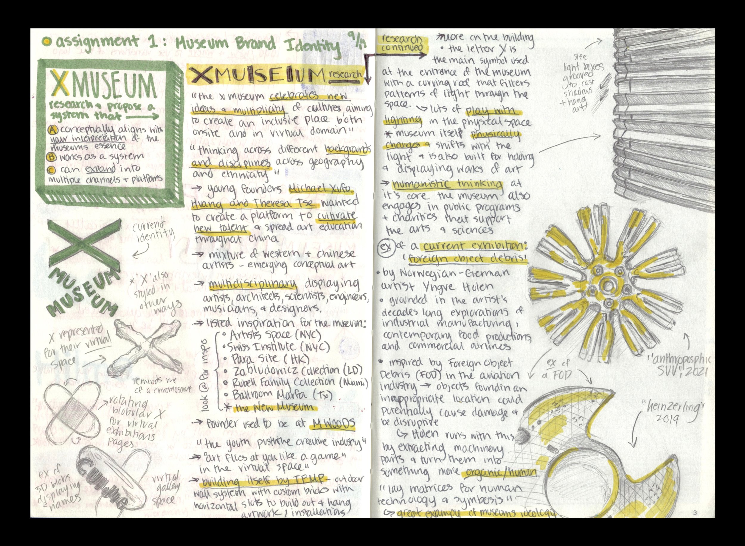
Initial notes on the museum’s core values to help me better understand how to craft a new identity.
Early concept sketches on how to express the ‘X’ in the logomark.
A few other concepts I explored on how the ‘X’ can live and flex in the identity before ultimately turning back to my original sketches.
Playing around with how to balance the lockup. For a while I wasn’t sure if I wanted an outlined or solid ‘X’ to exist next to the type.
For a while I thought I had to refine the mark and take the best combination of all of the options I had been playing with. I ended up rejecting this idea in favor of utilizing three X’s as shifting through three main logo marks felt more inline with the museums core mission to be a dynamic space for a multiplicity of Chinese and Western artists.
I was briefly convinced I wanted to use a neon green in the identity and lean into fun textures and glitching effects. I ended up deciding that was trying to force a “futuristic” feel to the identity versus innovation and multiplicity.


